UI Design & Photography
Dal Moro’s Fresh Pasta
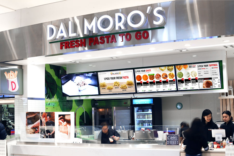
The owner of Dal Moro's first Canadian food court franchise approached me to redesign their menu. The franchise would be located inside the Vaughan Mills Shopping Centre Food Court, and the menu needed to stand out amongst the competition.
What are the customer’s saying?
We started the project by reviewing customer feedback. Customer’s were asked what they thought about their experience at Dal Moro’s, and here’s what we found:
- Product names and descriptions are too small, making it difficult to read.
- People noticed the price straight away but harder to see the product descriptions.
- People didn’t realize they could choose their own pasta and sauce pairings.
- The menu wasn’t up-to-date. It showed products that the store didn’t offer.
- The product images shows the pasta itself hidden inside the container, which makes it hard to see the final product.
- The menu was cluttered and not easy for a passerby to understand at a glance.
Review of Existing Menu
The existing menu suffered by having too many elements on the screen, which made it difficult to read and understand. There was an overemphasis on the price, and not enough focus on the product name, images, and descriptions. The menu also showed items that were not available at this location. Overall, the menu needed to be redesigned for accuracy, clarity and overall appeal.
Approach
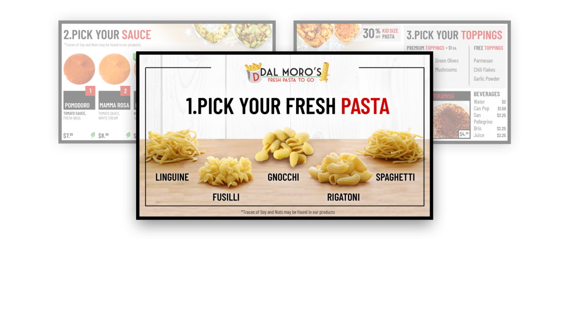
Build your own pasta
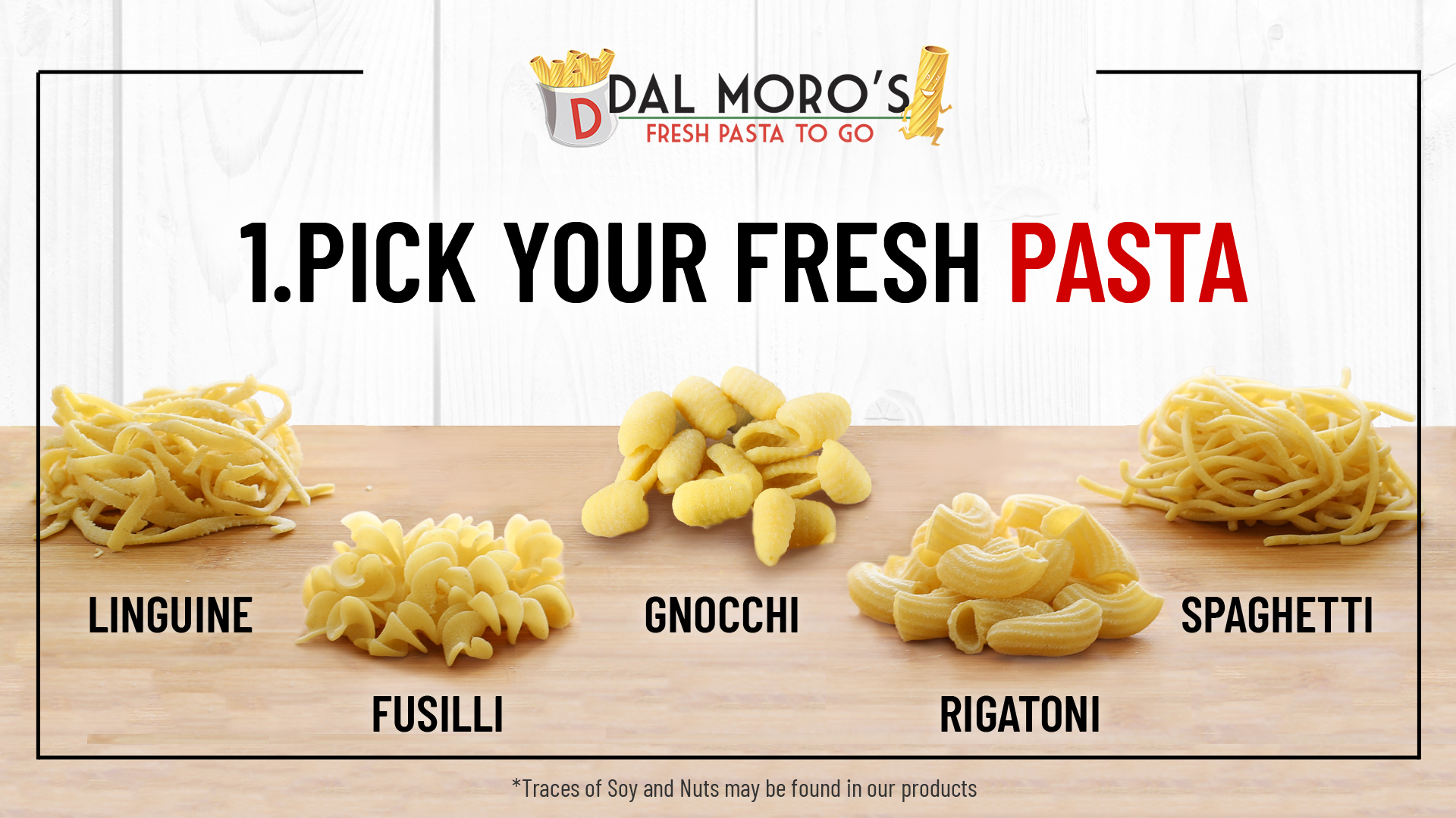
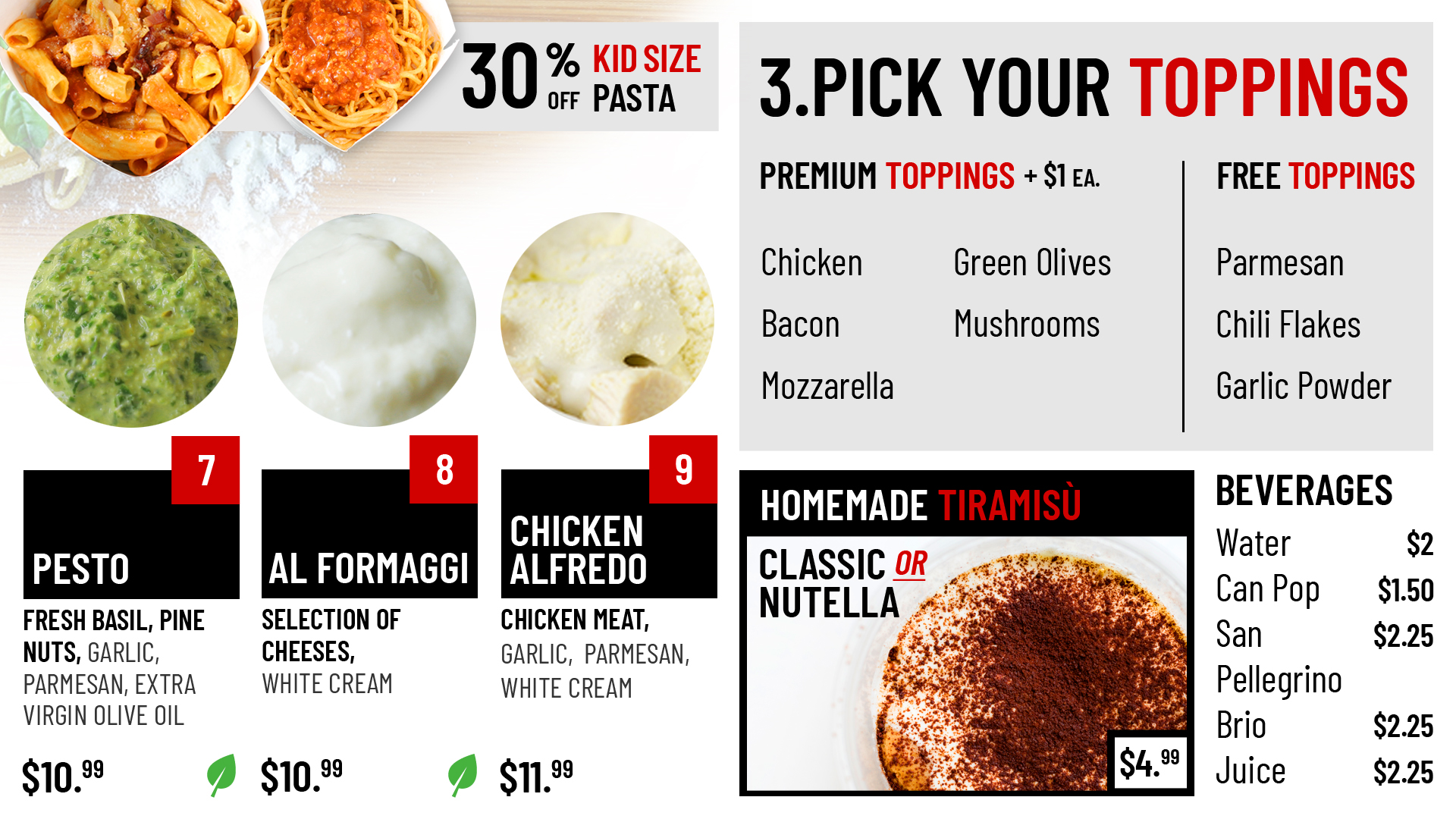
By organizing the menu into a step-by-step layout, customers immediately understand how to order and have confidence ordering. It is also a great way to encourage customers to consider optional upgrades.
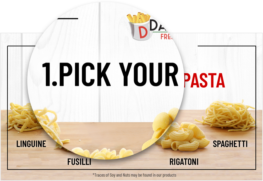
Create a sense of hierarchy
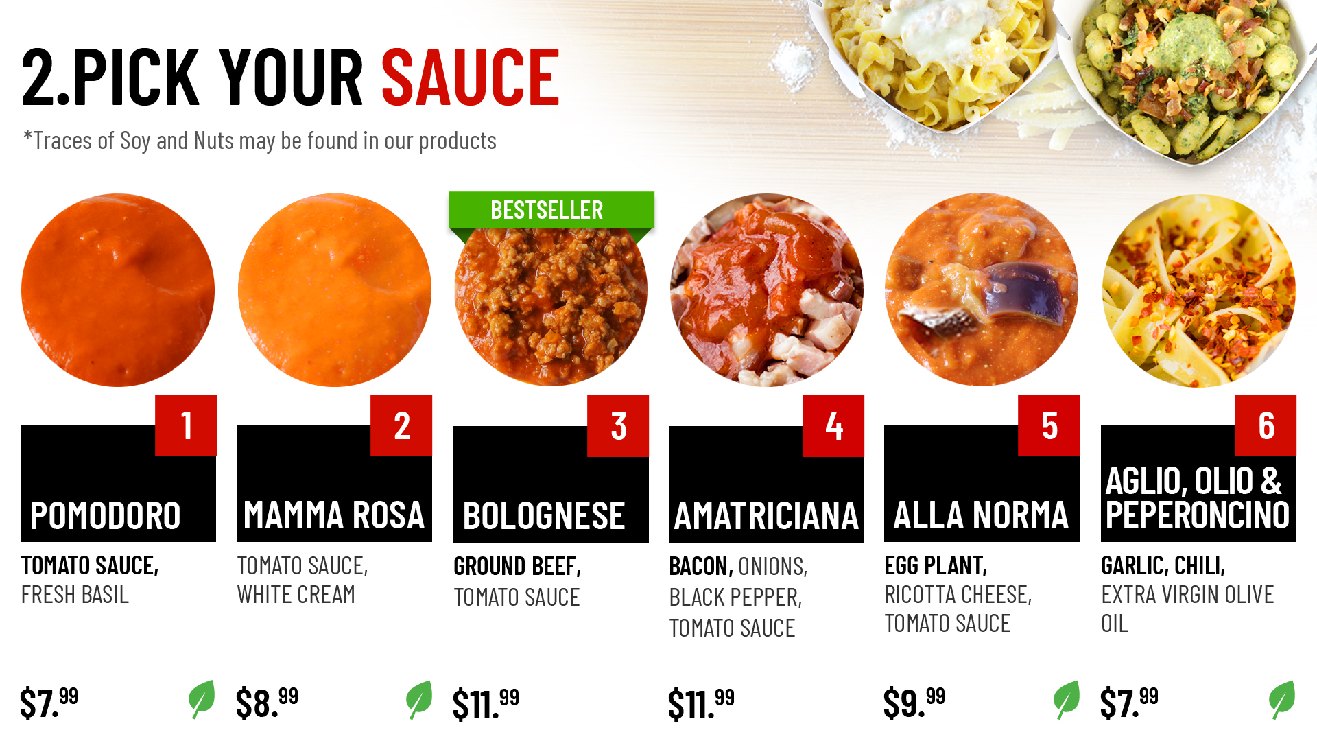
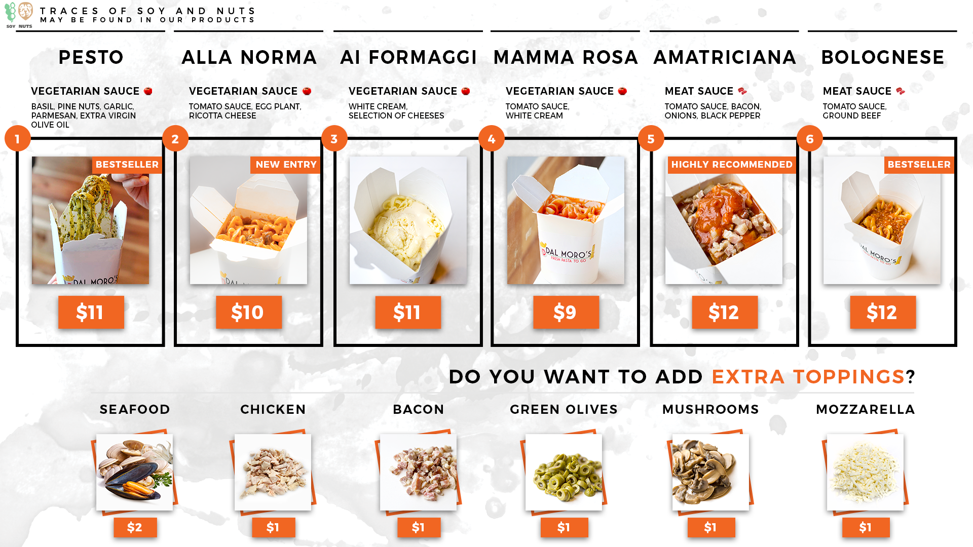
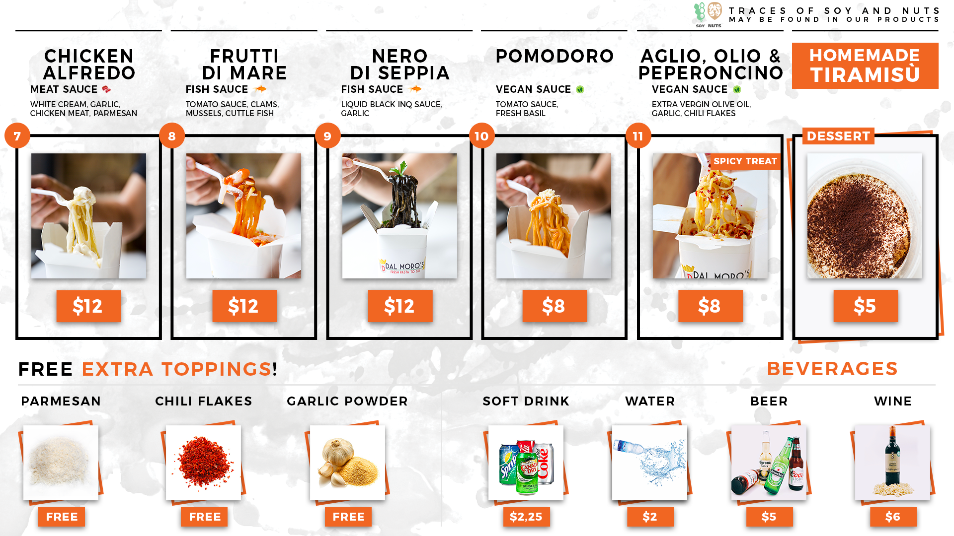
The hierarchy was restructured to highlight the product images first, product names directly below, followed by the description, and finally the price at the end. The idea is to first appeal to people’s tastebuds with the picture, then give them the information they need based on order of importance.

Clear descriptions
Most of the sauces have italian names which can be confusing and intimidating to people. In order to make this process easier, the ingredients of each sauce is clearly written with the main ingredients bolded.
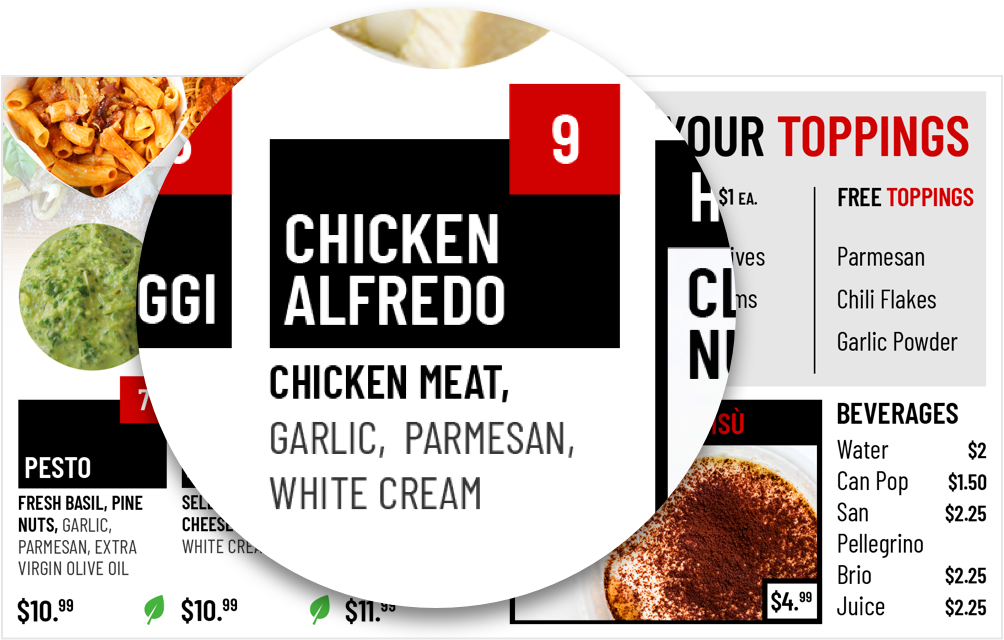
Refresh the images
In order to accommodate the new design, new photos were taken to achieve a consistent look.
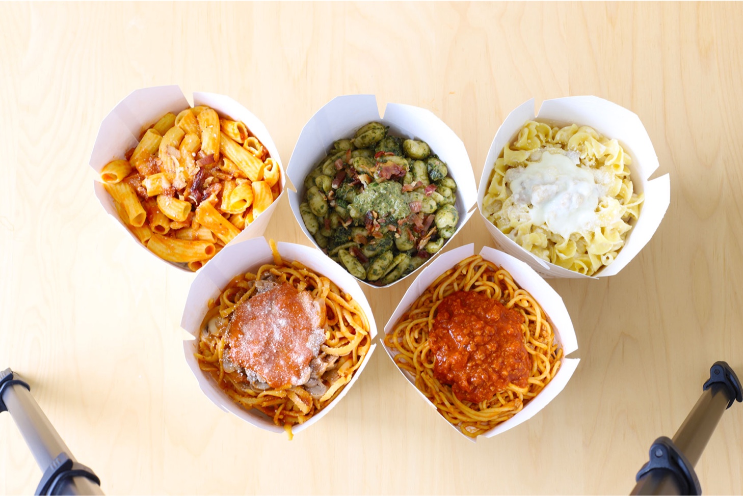
Final
After implementing the new design, there was a significant improvement in the legibility and readability of the menu. According to my client, people were no longer squinting at the menu, and had improved understanding of the product offering.
